Sherman Oaks Family Home : A True Californian Renovation
- May 6, 2017
- 2 min read
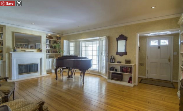
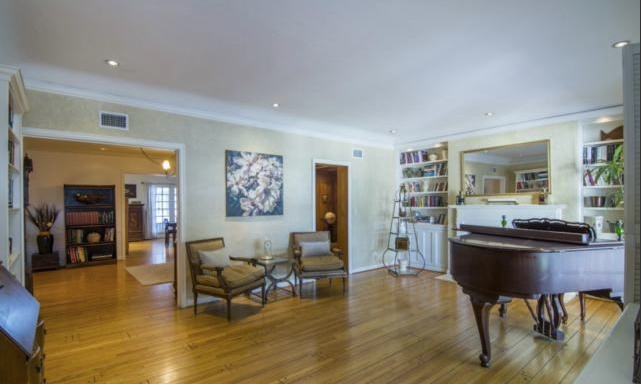
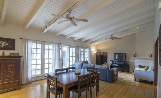
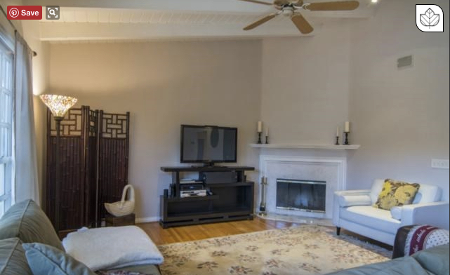
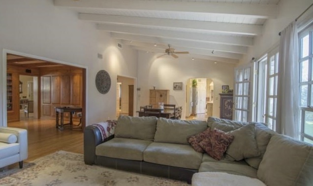
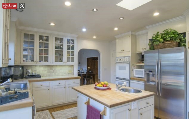
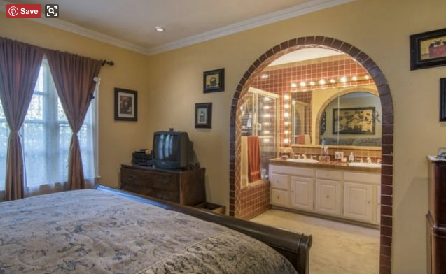
This adorable family of four bought a lovely house on a beautiful street in Sherman Oaks. As you'll see from the the before pictures it was a *tad* outdated and embodied what I'd call a incredibly disjointed design - one room looked like an English Tutor library, the kitchen was very country living, and the master bathroom looked like it came straight from a 1980s Southwestern hotel. There are no rules in Los Angeles which is what makes design so incredibly fun but also at times aggravating.
Before:
We made major changes to the interior - basically gutted the entire home and reworked the layout creating a master bedroom, bath, closet and two additional en suite bathrooms. The great room, kitchen, and dining were completely opened up. We added large sliding doors to the exterior of the home to create that amazing indoor/outdoor flow. To accommodate the new layout, we chose to forgo a formal living room, and instead create a comfortable formal sitting area / potential family game table across the entry.
Here is the new exterior and entry shots - note the pretty light that floods the entire hall from the back of the house. We used Hague Blue by Farrow & Ball on the front door, in the powder room as a stripe, and in the laundry/mudroom for the walls.
The new kitchen, dining and family room:
And last but not least, the master and ensuite bedrooms and baths:
What a transformation huh? I love this house - the open layout combined with fantastic ensuite bedrooms and plenty of natural light make it an ideal Californian home.
Credit to the amazing team:
Jon Brouse, Architect
Akos & John at Renovatio Construction
Flooring by Martin Lane Elements
Window Treatments by Galaxy Draperies
Photography by Amy Bartlam
Thank you for looking and reading!
- Lucie










Comments